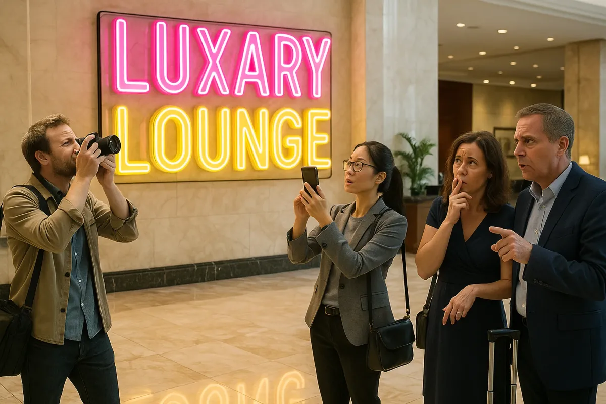
In the past week, a Bored Panda feature showcasing “design examples that show how important proper spacing really is” has been shared, mocked, and memed across social media. From unfortunate word breaks on public signage to chaotic letter spacing on packaging, these typographic disasters are everywhere—and they are resonating far beyond the world of graphic designers.
Beneath the humor lies a very current truth: in 2025, the true mark of a refined home is no longer just expensive finishes, but the precision of visual communication within a space. As the internet amplifies bad design in seconds, homeowners renovating at the high end are quietly gravitating toward interiors where typography, alignment, and spacing are treated with the same reverence as stone, wood, and light.
Luxury is no longer loud. It is legible, deliberate, and exquisitely spaced.
Below are five exclusive insights for homeowners who understand that in a visually ruthless, screenshot‑ready world, the smallest typographic decision can elevate—or cheapen—an entire renovation.
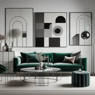
1. Typography Is the New Millwork: Treat Lettering as Architectural, Not Decorative
The viral “spacing fails” making the rounds this week are funny precisely because the letters feel like an afterthought—jammed in, badly broken, or randomly aligned. In a premium home, lettering should feel as considered as a custom staircase.
Think of typography as micro‑architecture on your walls: the house number at your entry, the discrete directional signage to a home spa, the etched lettering on a wine room door, the monogram subtly inlaid into stone. The fonts you choose, their weight, their spacing (kerning and tracking), and even their relationship to light all contribute to perceived value.
Instead of ordering off-the-shelf plaques, collaborate with your designer and fabricator:
- Integrate letterforms into joinery (for example, a library door with the word “BIBLIOTHÈQUE” inlaid in brass, perfectly centered and aligned to the mullions).
- Treat house numbers as a sculptural element—overscaled, precisely spaced, perhaps backlit—anchored to the architectural grid of your façade.
- For large estates, consider a subtle, hotel-caliber wayfinding system where typography guides guests intuitively without visual noise.
The difference between “beautiful” and “bespoke” often lies in whether text is applied to the space—or designed into the space.
2. White Space Is the New Status Symbol
The Bored Panda examples highlight a common sin: cramming too much into too little space, resulting in distorted, unreadable text. The same mistake is rampant in interiors. Overfilled gallery walls, logos on every surface, text art jammed into confined areas—these choices read as visual anxiety, not luxury.
In 2025, the most forward-thinking high-end homes are leaning into spaciousness as a design language. White space—on walls, in corridors, around art, and yes, around any typography—is becoming the quiet hallmark of a confident interior. You are signaling that your home doesn’t need to shout to be noticed.
For your renovation:
- Allow generous margins around any wall text, signage, or art with lettering. The breathing room is what makes it feel curated rather than commercial.
- In kitchens and bathrooms, resist the temptation to plaster words (“EAT,” “SOAK,” “LAUNDRY”) in tight spaces; if you use text at all, let it be minimal, architectural, and surrounded by calm.
- When commissioning custom art pieces that include writing—poetry, coordinates, family mottos—think of them as one or two significant works, not a motif to be repeated.
Luxurious space is felt as much in what is not there as in what is. White space is not “empty”; it is intentional silence.
3. From Meme to Mastery: Avoid “Cursed” Lettering by Designing for the Camera
The reason those typographic fails go viral is simple: they photograph hilariously badly. That same reality now applies to your home. Friends, guests, and even your designer will inevitably capture your interiors—and any textual elements—on smartphones. What reads clearly in person can easily compress into chaos on camera.
Discerning renovators are starting to do what high-end retailers and boutique hotels have done for years: design every typographic element to be “camera-proof.” That doesn’t mean designing for Instagram—it means ensuring your home never becomes a punchline in someone’s design-fail compilation.
Practical strategies during renovation:
- View all signage, house numbers, and lettered elements through a phone camera at various distances before finalizing placement. Check for legibility, glare, and awkward line breaks.
- Test lighting conditions at multiple times of day. A perfectly spaced brass script can become illegible if a downlight throws harsh shadows through it.
- Ensure any line breaks in text are intentional and elegant; avoid breaking words across lines, which is precisely what creates many of the now-viral fails.
The emerging rule of refined residential design: if it involves words, it must withstand both the trained eye and the casual snapshot.
4. Bespoke Lettering as a Quiet Luxury Signature
In a week when the internet is collectively laughing at mass-produced design mistakes, the most sophisticated homes are leaning into the opposite: one-of-one, handcrafted letterforms that cannot be found—or mocked—anywhere else.
Rather than relying on ubiquitous fonts, homeowners at the top end are commissioning typographers and calligraphers much as they would commission an artist. A custom alphabet, a bespoke monogram, or a tailored number set for your address can become the subtle, recurring thread that ties your renovation together.
Ways to weave this into your project:
- Collaborate with a type designer to create a custom numeric style for house numbers, gate codes, elevator indicators, and even subtle inlays on joinery. Repetition in different materials (metal, stone, glass) creates a quiet but cohesive brand for your home.
- Consider commissioning one refined phrase—perhaps a line of poetry or a family motto—in a unique hand, then translate it across mediums: etched glass in a wine cellar, subtly debossed leather on a media room door, or tone-on-tone plaster relief in an entry niche.
- Replace off-the-shelf label systems (pantry, dressing room, wine categories) with a unified, custom type system that is small-scale but exquisitely executed.
In a world saturated with generic fonts, the most decadent luxury is owning letterforms that exist nowhere else.
5. The New Design Checkpoint: A Typographic Walkthrough Before You Sign Off
The global ridicule aimed at poor spacing this week underscores something crucial: bad typography is rarely a single big mistake; it’s a chain of small, unchecked decisions. On a renovation, those decisions often occur at the very end—when everyone is tired, budgets are stretched, and “just get the signage up” becomes the prevailing mood.
Sophisticated renovators are now building in a dedicated “typographic walkthrough” before final completion, the way one might schedule a lighting or art placement review. This is not merely a punch list; it is a focused audit of every letter, word, and number in the home.
Elements to review with designer and builder, preferably together on-site:
- Exterior: house numbers, gate codes, mailbox text, intercom labels, parking or garage markings. Confirm scale, alignment, and readability from the street and driveway.
- Entry & circulation: door labels (if any), elevator panels in multi-level homes, directional cues in larger estates or multi-wing properties. Ensure hierarchy—what the eye reads first—is intentional.
- Functional spaces: laundry, pantry, wine room, spa, gym, home office—anywhere labeling appears on doors, cabinetry, or controls. Look for consistency in font, weight, and spacing.
- Integrated technologies: thermostat labels, lighting scenes, smart home touchscreens. Many systems default to clumsy typography; customizing these can dramatically elevate the perceived quality of the entire space.
By formalizing this stage, you avoid the quiet but costly outcome of a meticulously renovated home undermined by amateurish labeling and uncoordinated lettering.
Conclusion
As social media gleefully circulates images of disastrously spaced signs and “cursed” letter combinations, an unexpected design truth is emerging: typographic precision has become a core indicator of taste. The homes that will feel timeless in this hyper-visual era are those where words—however few—are as thoughtfully designed as walls, windows, and furniture.
For the discerning renovator, this is an opportunity, not a constraint. By elevating typography from afterthought to design discipline, you create an environment that photographs beautifully, lives gracefully, and communicates—with quiet authority—that every detail has been considered.
In a world that can turn any misaligned letter into a viral joke, the most luxurious decision you can make is to ensure your home never needs a caption to explain itself.
Key Takeaway
The most important thing to remember from this article is that this information can change how you think about Design Trends.